BI Dashboards are the new Macromedia Flash
Page is part of Articles in which you can submit an article
written by owen on 2019-Mar-01.
I have been looking at tonnes of business intelligence (BI) software tools for the past couple of months. Everything from #tableau to #looker. They all fall into some kind of "editor that creates charts" similar to how flash did websites back in the 2000s. However the similarities to flash go way beyond them being just an editor. BI has been taking on alot of the negatives of Flash as well. I will outline a few that I have noticed;
The wild west of data wranglers
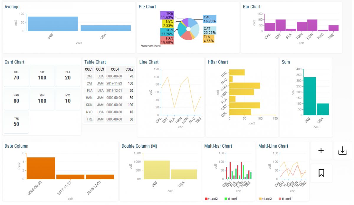
BI dashboards seem to have no rules to how complicated they can get and how far the users are willing to push them to produce results. Especially when combined with custom programming languages and advanced features you often end up with a Rube Goldberg machine of complications which will be a nightmare to maintain. A soup of buttons, configs, levers, flags and settings so deep that no one except the original creator will want to touch it. Each dashboard being a custom ball of mud.
Self service is a marketing gimmick
Self service BI is often sold as the key feature of the BI tools - "bringing bar charts to the common man". But like flash it has a learning curve that is tuned to a certain type of individual. If you throw self service into a pool of employees some will use it but most will not - it is the general nature of the producer vs consumer matrix. The ones that do produce new dashboards end up giving themselves additional work and responsibility to ensure that what they produce is accurate. The BI tools will certainly take no credit for a bad dashboard.
You so fancy
Pretty charts are everywhere in the BI space. Just like Flash, the prettier it is - the longer it takes to load and the information density increases. The novelty eventually wears off and you have to get down to business. Diminishing returns kick in and you will have to redesign that beautiful flash website that you took 2 years to create which is not a problem in flash because all you have to do is start over from scratch. On the flip side with BI dashboards you tend to pile on more and more technical debt the further you go. The ease of entry into the BI space gets eclipsed by never ending subscription costs and balls of mud that live in the cloud.
Data abyss
Bi users are pumping more and more data into their dashboard tools which often provide no way of extracting this data or moving it to some other format except for charts. Eventually this abyss will get so deep and wide that no one will know whats inside of it. You can see the data, look at it but a journey into its depths might mean certain death even for the bravest of data scientists.
Conclusion
Certainly BI dashboards wont meet the same fate as flash but you never know. Artificial Intelligence, Machine Learning and the common data model could change the whole game.
permanent link. Find similar posts in Articles.
comments
Comment list is empty. You should totally be the first to Post your comments on this article.